Accessibility in Canvas
Headings and Accessible Files
Pages
When designing content pages or files that will be linked into the course, headings are a simple way to increase accessibility.
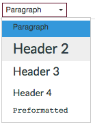
When creating a page in Canvas, use headings to organize the text instead of bolding or changing the font to indicate titles and subsections.
While a heading will be picked up by a screen reader and used to indicate the page formatting to the listener, bold text will not. Instead, the whole page will be read aloud as a single block of text. Essentially, headings allow the page to be easily navigated by breaking the page into pieces of information that are easy to scan and digest.
If you are unsure of how a piece of text will sound in a screen reader, use a screen reader simulator tool to test the page.
Files
The same concept can be applied to files that are being used in the course. Microsoft Word allows for headings to break text into sections that are easily interpreted by a screen reader.
Links
Accessibility can be increased by embedding links, as opposed to simply copy/pasting a url into the page. The following example illustrates the difference an embedded link makes, not only for the screen reader user, but also for the visual appearance of the page, making it easier to navigate.
Bad Example
"Donald Tapscott, in his paper ''Growing Up Digital," http://www.ncsu.edu/meridian/jan98/feat_6/digital.html says these students..."
[Listen to bad example audio from screen reader]
Good Example
"Donald Tapscott, in his paper ''Growing Up Digital," says these students..."
[Listen to good example audio from screen reader]
Embedding Links in Canvas
For links to external websites:
- Type the text that will function as the link.
- Highlight the text and select the "Link to url" tool.
- Copy/paste the url into the field in the pop-up window that appears.
- Select "Insert Link".
- Your embedded link will be highlighted in yellow momentarily to indicate success and will appear as an underlined link thereafter.
For links to course content:
- Type the text that will function as the link.
- Highlight the text.
- On the right hand side of the screen (if your browser resolution is small, this will appear at the bottom of the screen) select whether you would like to link to Links (course content), Files, or Images.
- Select the content you want to link to.
- Your embedded link will be highlighted in yellow momentarily to indicate success and will appear as an underlined link thereafter.
Visuals
Images
All images used in the course should include a short image description. When you upload an image into Canvas, you will be prompted to an alt text. This text will be read by screen readers or will be displayed if the image fails to load.
Example:
Alt text: one boy and two girls sitting on a couch with a smartphone, tablet, and laptop.
Videos
All videos used in a course should include captions. Instructors can Caption Panopto Videos.
Color
Font colors and background colors should be highly contrasting, allowing students to easily read written content. The following are examples of Rich Content Editor Colors Contrast Ratios within Canvas:
Fail: (under 4.5)
- Yellow Text: 1.07:1
- Pale Green: Text 1.12:1
- Orange Text: 2.14:1
- Pink Text: 3.14:1
- Red Text: 4:1
Good: (4.5 to 7)
- Blue Text: 4.68:1
- Dark Green: 5.14:1
- Purple Text: 6.95:1
Best: (Over 7)
- Burnt Orange: 7.43:1
- Very Dark Gray: 12.63:1
- Black text: 21:1
Additional Resources
A more detailed guide on designing accessible content through Canvas will explain how to do so for content in different formats and programs including PDF and Microsoft Word.
Canvas also has a statement on compliance to accessibility standards available to the public.


