/
Responsive Sitecore - Page Layout
Responsive Sitecore - Page Layout
General guidelines:
| |
Page titles should:
| |
Calls to action:
| |
Body copy:
| |
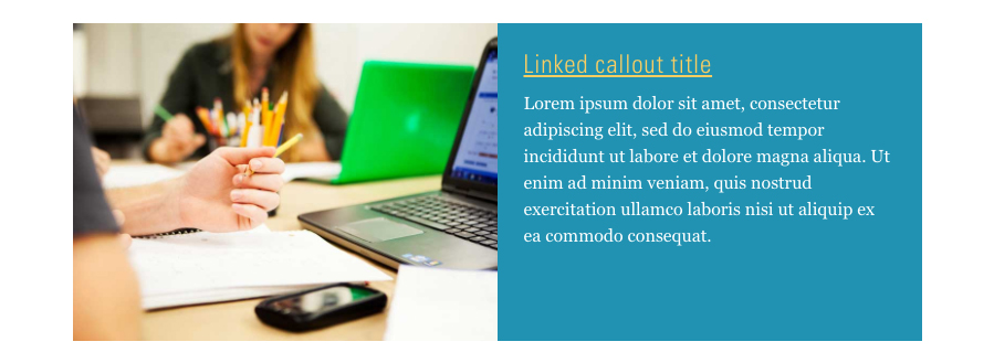
Image callouts:
| |
Section headings:
| |
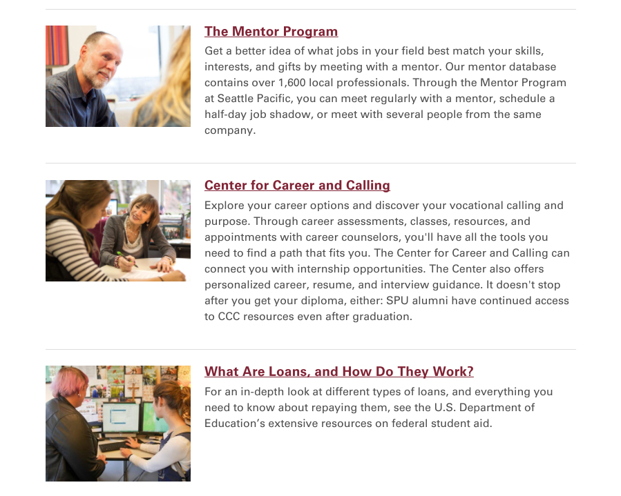
Featured content list:
| |
Full page width panel:
|
Related content
Responsive Sitecore Components Guide
Responsive Sitecore Components Guide
More like this
Sitecore Web Image Sizes
Sitecore Web Image Sizes
More like this
Sitecore: The Experience Editor
Sitecore: The Experience Editor
More like this
Sitecore: Adding images
Sitecore: Adding images
More like this
