Poll Everywhere New Visual Designs 2023
Poll Everywhere has announced the launch of their newly redesigned activities in August 2023. These new visual designs have been introduced to modernize the activities and enhance their appearance, all with the goal of assisting customers in creating engaging presentations that captivate their audience. In this release, we are excited to introduce you to these fresh designs:
- ✅ Activity Joining Instructions & QR Code
Joining and voting instructions will remain at the top of the activity screen. QR codes are now added by default to the joining instructions at the top of the activity screen. Participants have the option to easily scan the QR code with their mobile phone, which will direct them to the activity answer page.
- 🎨 Brighter Colors that Make Your Activity Stand Out
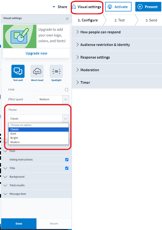
The new release updated the Classic color theme to a brighter blue background and introduced a colorful new Modern theme with a captivating gradient blue and purple background. Both color theme options are now available in the visual settings.
- ⏰ Timer
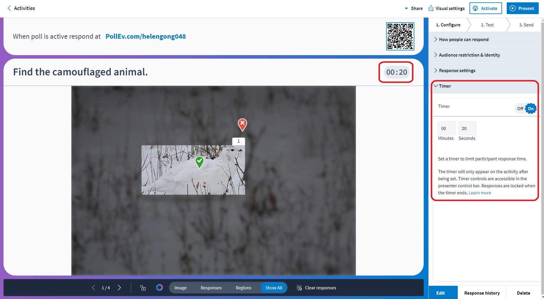
The timer function is now displayed on the top right-hand side of the activity screen. There will also be a countdown in the presenter controls bar. By default, when the activity is first created, the timer will be set to OFF. Settings for the timer are located in the Configure tab. To turn on the timer, navigate to the Configure tab and click on the Time ribbon. There you can toggle the on/off button for the timer.
- 🔧 Presenter Controls Bar
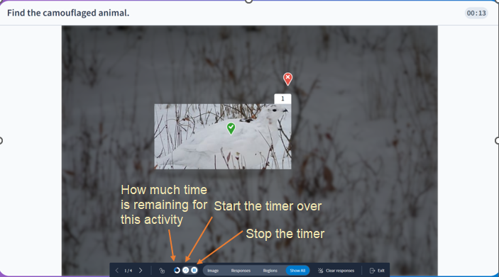
We've added several new control features to the Presenter Controls Bar, including:
- Timer and a circle display which shows how much time is remaining.
- Restart button allowing presenters to start the timer over.
- Pause button to stop the timer if needed.
Visual Improvement for Main Activities
- Multiple Choice
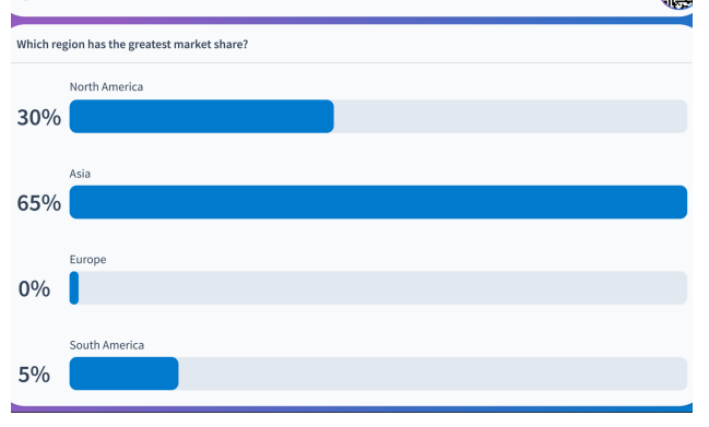
Bar & Column Charts
Bar column charts have been updated visually to have a cleaner look that's easier to read. As answer results come in, the columns will continue to change according to the live results. The answer results are now displayed on the outside of the columns for increased visibility.
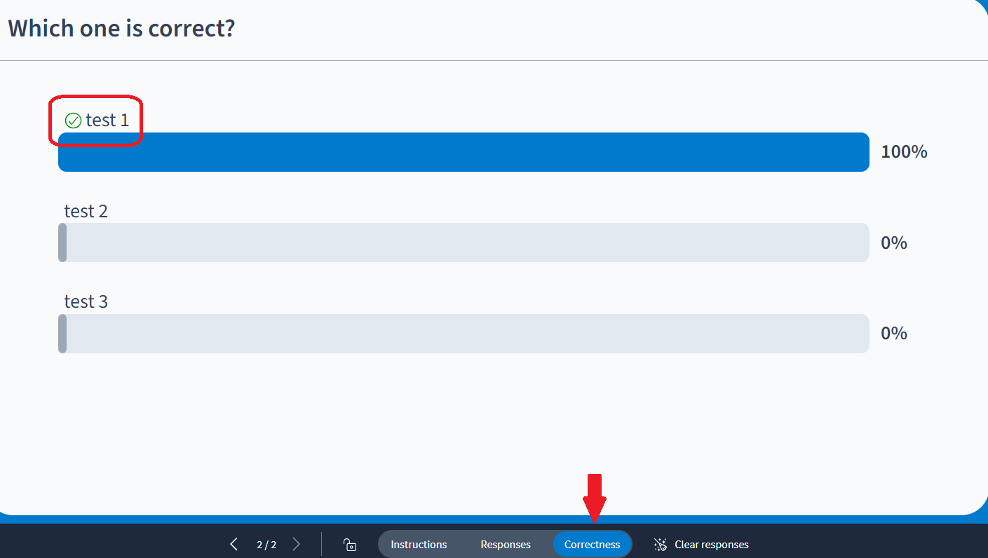
Correctness
Correct answers will now show a green check mark and will be highlighted in a selected color while all other answers will be grayed out.
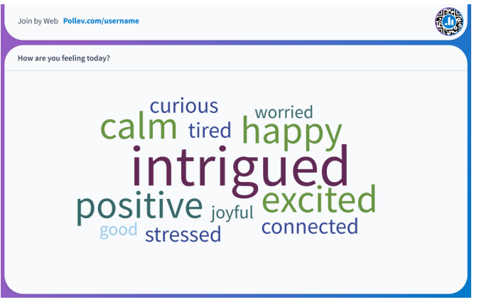
- Word Cloud
The new release has made all words in Word Clouds horizontal. This new layout will make it easier for the audience to read submitted responses.
- Q&A
The Q&A upvoting and downvoting feature has been redesigned with thumbs up and thumbs down buttons to make it easier for participants to interact with responses. In the new design, you will need to click on the checkmark icon to mark a question as answered.
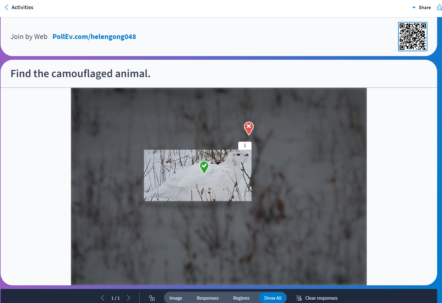
- Clickable Image
The new design made activities more inclusive by addressing specific accessibility pain points. For example, the design updated the correctness feature on clickable image so that correct answers are represented with a checkmark or an X, no longer relying solely on the marker’s color to indicate correct answers.
- Open Ended
The new redesign increased the spacing in between participant responses as well as made it easier to scroll through responses. The new design also changed the spotlight feature so that it enlarges the selected answer and makes it easier to read. (You can click on the star icon to spotlight the selected answer)
- Multiple Choice
Bar & Column Charts
Bar column charts have been updated visually to have a cleaner look that's easier to read. As answer results come in, the columns will continue to change according to the live results. The answer results are now displayed on the outside of the columns for increased visibility.
Correctness
Correct answers will now show a green check mark and will be highlighted in a selected color while all other answers will be grayed out.
- Ranking
Ranking activities have been redesigned to be cleaner and easier to read. Column bars are now thinner allowing for more answer options, and the ranking number position is now displayed on the outside of each bar column. The process for creating Rankings is still the same.
- Survey
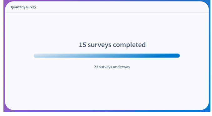
Surveys are now easier to read and navigate through submitted responses. To help you focus on the results of the survey, the new design removed the names of the respondents from the activity display. As long as surveys are set to track responses and not set to anonymous, you can still find this information if needed.
- Competition
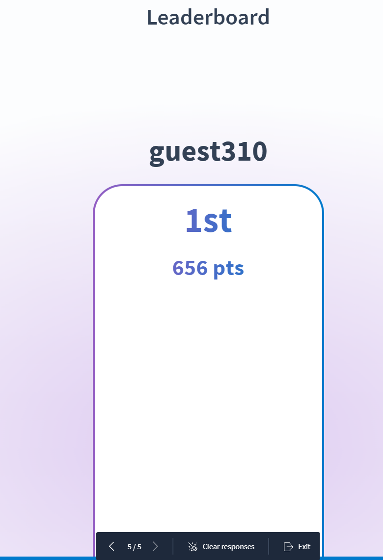
Competition titles have been moved so they are front and center. This will allow participants to quickly and easily read each question. Within the leaderboard, participant names are now spaced out further to make it easier to see who is in the lead. Participants will still see the confetti at the end of the competition.
Important Bug Fixes
- Line breaks, italics and other HTML tags are now fully functional in activity titles for Competitions.
- Competition scores are now calculating correctly based on participants’ response time.
- Scaling for poll response options has been fixed so that longer answer options adjust to the screen properly.
- Ranking activities have been fixed to ensure that image answer options are visible.
- Fixed timer activation when lock and unlock are indicated.
- Instructor activity flows inserted into Google slides have been fixed to no longer display like Engagement flows.
